Flutter CheckboxListTile - A widget that has ListTile and checkbox in a row
Here we will implement how to create a custom checked listview in flutter application. In this app, we explain how to display CheckBox List using Flutter.

Flutter CheckboxListTile basically contains a single row that has a title, subtitle, and a trailing checkbox icon.
Flutter CheckboxListTile Widget
Flutter CheckboxListTile displays a title, subtitle, or description and a checkbox icon horizontally. The suffix checkbox icon is mainly defined through the trailing parameter.
By default, Flutter CheckboxListTile can show two lines of text. The title and the subtitle. As the first line of text is not optional but the second line of text or the subtitle i.e. optional. The texture of the leading and trailing widgets can be modified according to the properties given.
So, are you ready to make use of this widget package in the Flutter application? If so, then let's quickly jump into the usage and the ways a CheckboxListTile can be modified and used to make user-friendly apps. Here I am going to use an open-source UI Library known as GetWidget to build this CheckboxListTile widget in Flutter.
GetWidget CheckboxListTile
GFCheckboxListtile is a Flutter Checkbox ListTile. In this widget, we can design a title, subtitle, and a trailing checkbox widget. It has customization options which is an easy way to handle it as per the application and its requirement. The GetWidget CheckboxListTile displays the list of items in a card fashion.
How to Start
Now here is the guide about how we should start developing the GFCheckboxListTile Widget with the use of the GetWidget UI Library.
Getting started will guide you on how to start building a beautiful flutter application with the GetWidget UI library. You have to install the package from pub.dev, import the package in your Flutter project.
Install Package from pub.dev :
https://pub.dev/packages/getwidget
Import full package:
import 'package:getwidget/getwidget.dart';
Note: dependencies: getwidget: ^ 4.0.0
Keep playing with the pre-built UI components.
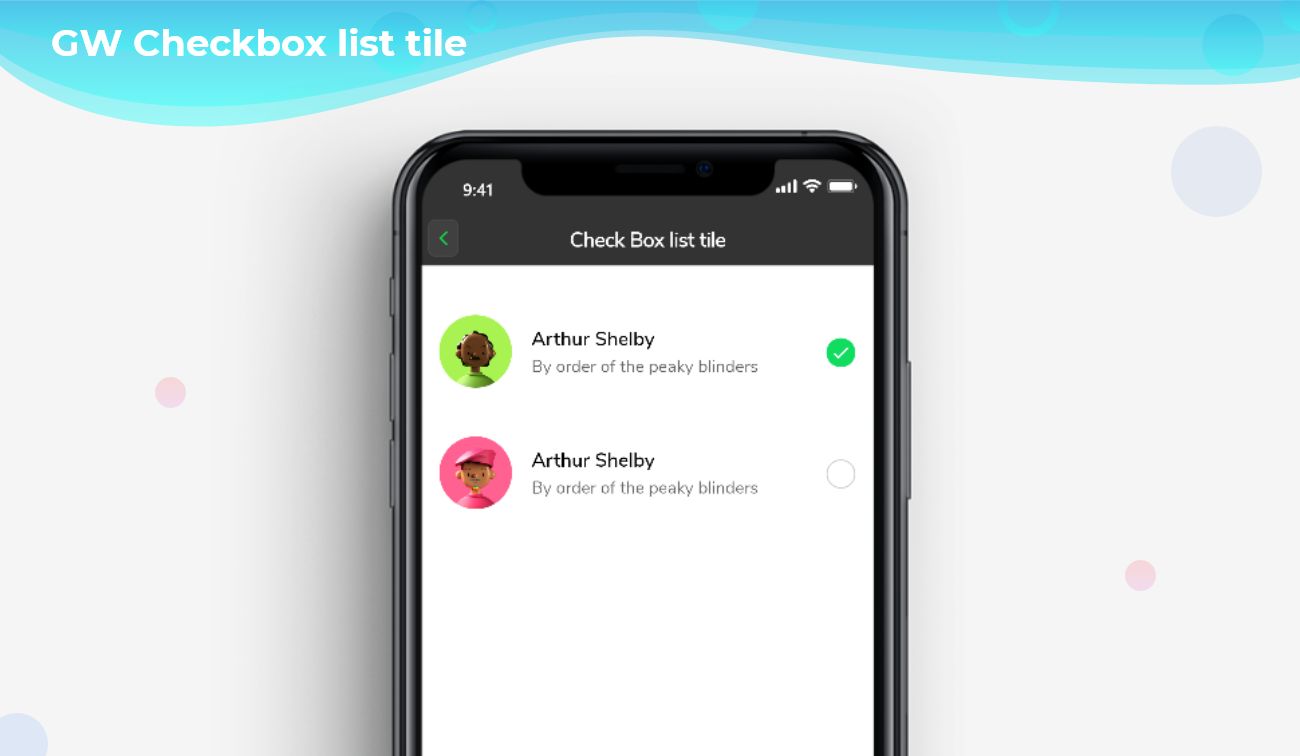
GFCheckboxListTile is a Flutter CheckboxListTile that has a list of items wherein the user can check or uncheck only one item in the list at a time. GFCheckboxListTile can also be positioned right or left of the screen according to the need. The below code gives a simple example with an avatar on the left side as shown in the below image.

import 'package:getwidget/getwidget.dart';

bool isChecked = true;

GFCheckboxListTile(
  titleText: 'Getwidget Library',
  subTitleText: 'This is a open source UI library',
  avatar: GFAvatar(
    backgroundImage: AssetImage('Assets image here'),
  ),
  size: 26,
  activeBgColor: Colors.green,
  type: GFCheckboxType.circle,
  activeIcon: Icon(
    Icons.check,
    size: 16,
    color: Colors.white,
  ),
  onChanged: (value) {
    setState(() {
      isChecked = value;
    });
  },
  value: isChecked,
  inactiveIcon: null,
),
Flutter Checkbox Listtile With Example Code
Flutter GFCheckboxListTile Custom Properties
The Look and feel of the GFCheckboxListTile can be customized using the GFCheckboxListTile properties.
| Name | Description |
|---|---|
| titleText | type of [String] used to pass text, alternative to title property and gets higher priority than the title |
| subTitleText | type of [String] used to pass text, alternative to subtitle property and gets higher priority than the subtitle |
| color | GFListTile's background color. Can be given [Color] or [GFColors] |
| avatar | type of [Widget] or [GFAvatar] used to create a rounded user profile |
| title | title to display inside the [GFListTile]. |
| subTitle | subtitle to display inside the [GFListTile]. |
| description | description to display inside the [GFListTile]. |
| position | allows the user to set the position of the checkbox to start or end |
| margin | defines the margin of GFListTile |
| padding | defines the padding of GFListTile |
| type | type of [GFCheckboxType] which is of four types is basic, square, circular, and custom |
| size | type of [double] which is GFSize ie, small, medium, and large and can use any double value |
| activeBgColor | type of [Color] used to change the backgroundColor of the active checkbox |
| inactiveBgColor | type of [Color] used to change the backgroundColor of the inactive checkbox |
| activeBorderColor | type of [Color] used to change the border color of the active checkbox |
| inactiveBorderColor | type of [Color] used to change the border color of the inactive checkbox |
| onChanged | Called when the user checks or unchecks the checkbox. |
| value | Used to set the current state of the checkbox |
| activeIcon | type of Widget used to change the checkbox's active icon |
| inactiveIcon | type of [Widget] used to change the checkbox's inactive icon |
| customBgColor | type of [Color] used to change the background color of the custom active checkbox only |
| selected | To have the list tile appear selected when the checkbox is checked, pass the same value to both. Normally, this property is left to its default value, false. |
| autofocus | on the true state, this widget will be selected as the initial focus when no other node in its scope is currently focused |
How CheckboxListTile is different from ListTile?
Both ListTile and CheckboxListTile are having almost similar properties. We mostly use CheckboxListTile in those sections where we are having a list of options to select but in the case of ListTile, it is not mandatory to use the checkbox widget.
 Sipra Acharya
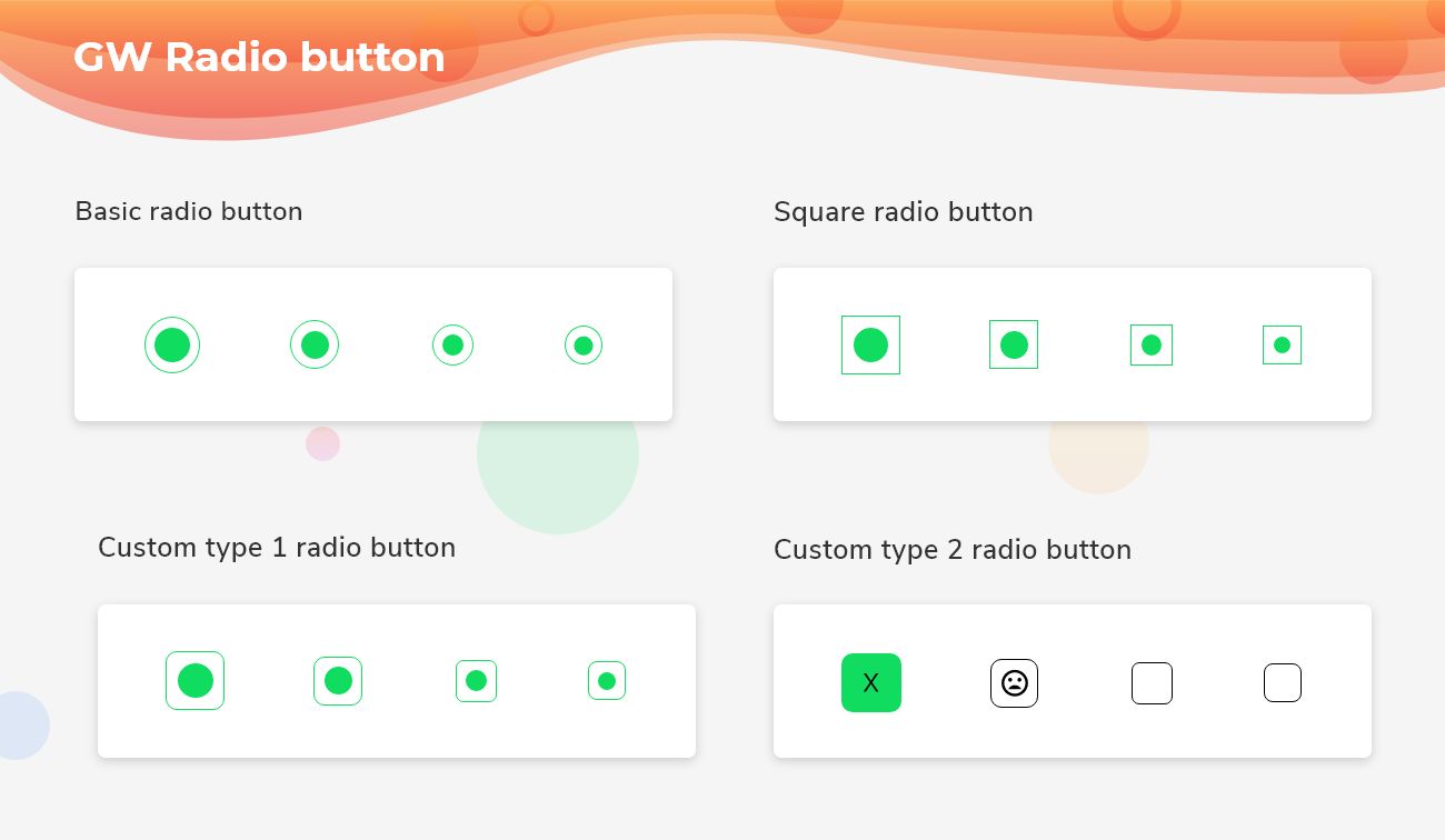
Can we change the background color of CheckoxListTile?
Yes, we can change the background color by using the color property.
Can we change the check icon of CheckoxListTile?
Yes, we can change the check icon and instead of this, we can use any other icon widgets also.
 getwidget
Please do appreciate our work through Github start
Conclusion:
Here we discuss, what Flutter CheckBoxListTile Widget is? And how we can use and implement it into our Flutter app through the GetWidget CheckBoxListTile component. Here, there are options to customize the CheckBoxListTile Button.
About Our Team:
We have been working on Flutter since Flutter launched in beta version in 2017. And our team have been putting hundreds and hundreds of hour to the experiment and implementation of Flutter. As well as after successful delivery of enterprise and SAAS applications that have been used by more than 500+ businesses around the 119+ countries. Now we are in love with Flutter development and we are very passionate about Flutter development. Now it is something we are trying to give a small contribution to the Flutter Dev Community. If you need assistance for your next app development project you can hire flutter app developer from the GetWidget team